
Hunger Express
A Multi-Sided Food Delivery Ecosystem for the Nigerian Market
Designing a multi-sided food delivery ecosystem (Customer, Rider, Vendor) under a tight 3-month timeline while adapting familiar global interaction patterns for the Nigerian market.
Designed three interconnected applications with a single-screen checkout, progressive order tracking, rider speed clarity, and vendor operational efficiency.
“How do you design a food delivery experience that feels familiar enough for users to trust immediately, while adapting it to a completely different market and supporting three different user groups?”
Project Overview
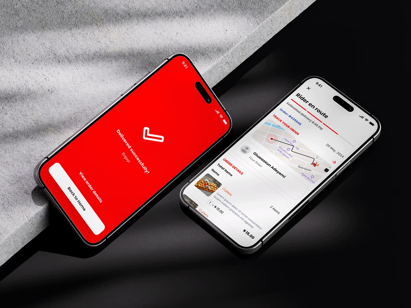
Hunger Express is a food delivery platform built for the Nigerian market that connects customers, restaurant owners, and delivery partners within a single ecosystem.
Unlike traditional portfolio projects that focus on a single application, this project required designing three interconnected products:
Customer App
Frictionless restaurant discovery, food customization, single-screen checkout, and order tracking.
Delivery Partner App
Speed, clarity, large touch targets, single-active delivery focus, and availability controls on the road.
Vendor App
Operational efficiency, instant incoming order alerts, preparation status, and dispatch controls.
Each product served different goals while sharing the same operational workflow—from discovering restaurants and placing orders to food preparation, delivery, and order completion.
The objective wasn't simply to create beautiful interfaces. It was to build a scalable ordering experience that felt intuitive for every participant in the delivery ecosystem.
The Opportunity
Nigeria's food delivery market continues to grow, but users have already become familiar with global experiences like Uber Eats.
Rather than reinventing an already successful interaction model, the opportunity was to build upon proven usability patterns while adapting them for the client's business requirements and local audience.
This approach reduced unnecessary learning for users while allowing development to move quickly.
The Challenge
This project came with two major constraints.
The complete ecosystem had to be designed within three months, leaving little room for lengthy discovery or multiple design explorations.
Instead of designing one application, every design decision had to work across three different user groups.
Although each product served different users, they all depended on the same ordering lifecycle.
My Approach
Given the project's timeline and clearly defined business direction, I adopted an execution-focused design process.
Instead of spending weeks creating low-fidelity wireframes, I moved directly into high-fidelity exploration using established interaction patterns.
This wasn't about skipping UX. It was about investing time where it created the greatest value.
Since food delivery is already a mature product category, many usability problems have already been solved by leading platforms.
Rather than redesigning familiar behaviors, I focused on adapting those proven patterns to meet the client's requirements while maintaining speed, consistency, and usability.
Learning Before Designing
Before opening Figma, I spent time studying successful food delivery products—particularly Uber Eats.
The objective wasn't to replicate screens. It was to understand why certain interaction patterns have become industry standards.
Instead of copying interfaces, I analyzed the principles behind them.
For example:
These observations provided a strong foundation for designing Hunger Express while leaving room for product-specific customization.
Key Design Principles
The competitive analysis helped define several principles that guided the product.
Familiar interactions reduce learning.
Users shouldn't need to relearn how food delivery works. Every tap should move users closer to placing an order.
Reducing unnecessary decisions increases completion.
Information should appear progressively. Instead of overwhelming users with choices, content should unfold naturally.
Speed matters more than decoration.
Food ordering is goal-oriented. Every interaction should support quick decision making.
Customer Experience
The customer application became the foundation of the ecosystem.
Its primary objective was simple: Help users discover food, customize their order, complete payment, and confidently track delivery.
Every screen was designed around reducing friction.
Discovering Restaurants
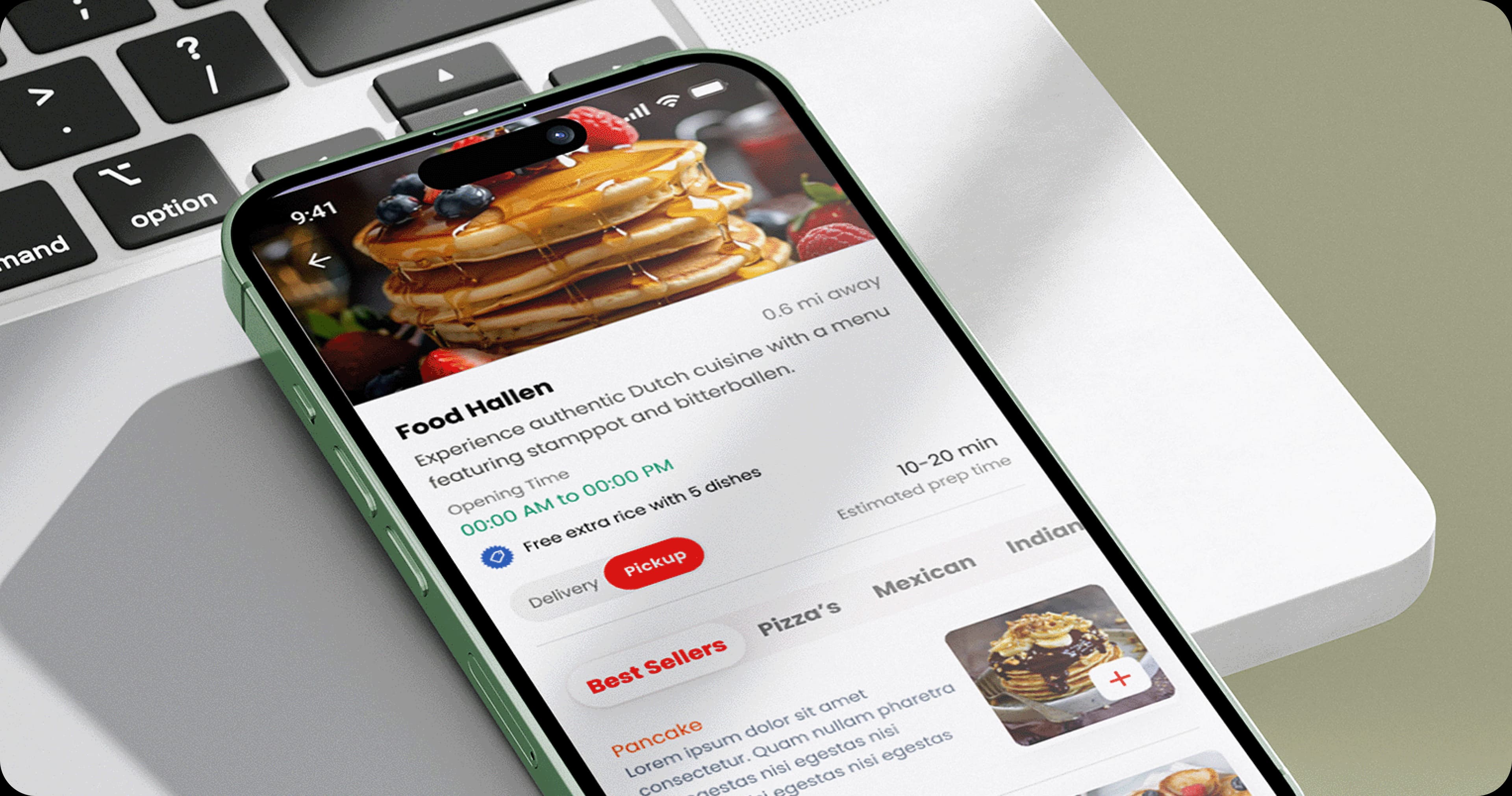
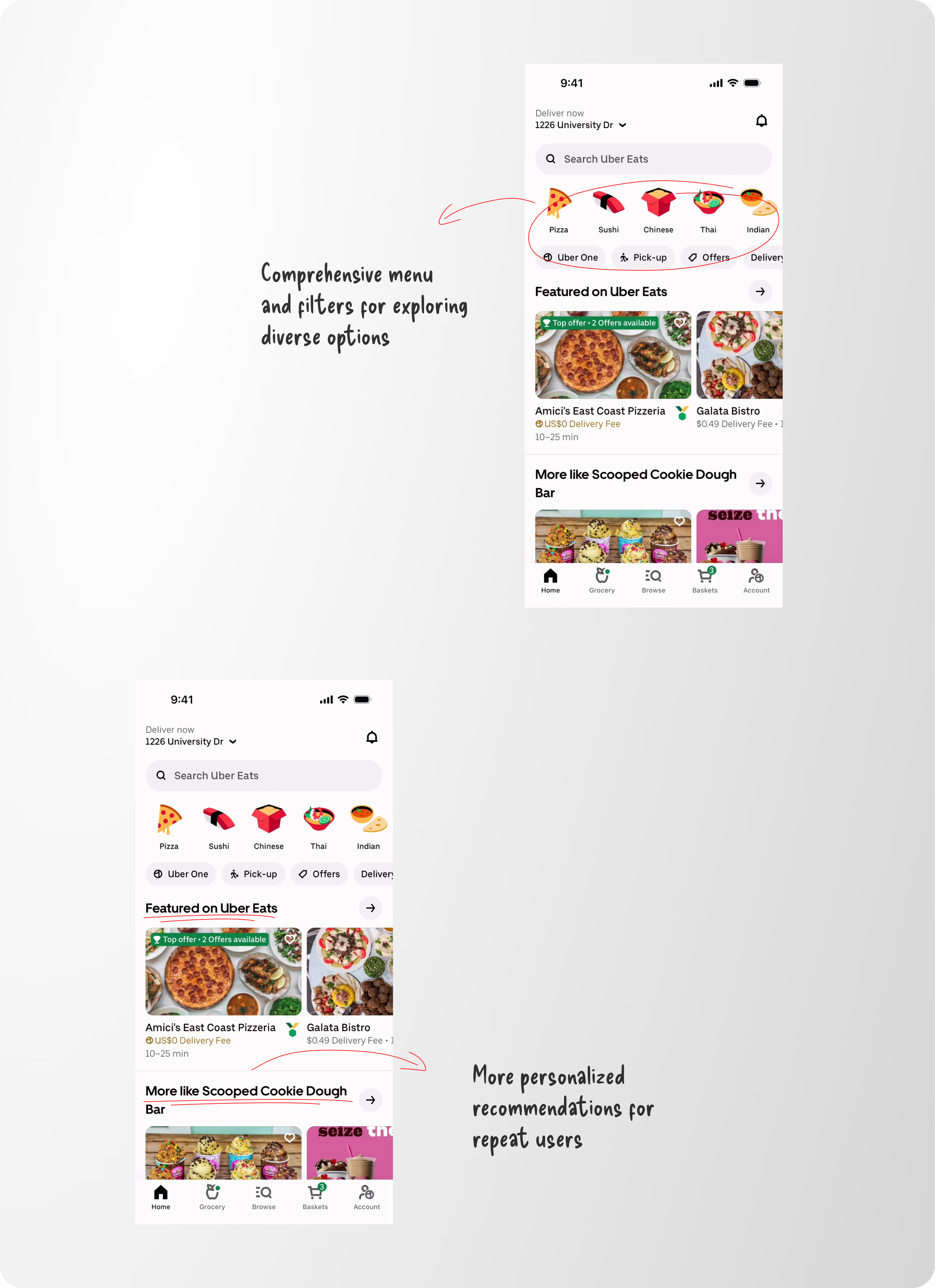
Restaurant discovery is the first decision users make. Rather than exposing every restaurant equally, the interface prioritizes categories, personalized recommendations, and visual content.
Large imagery helps users make quicker decisions while category filters reduce browsing effort.
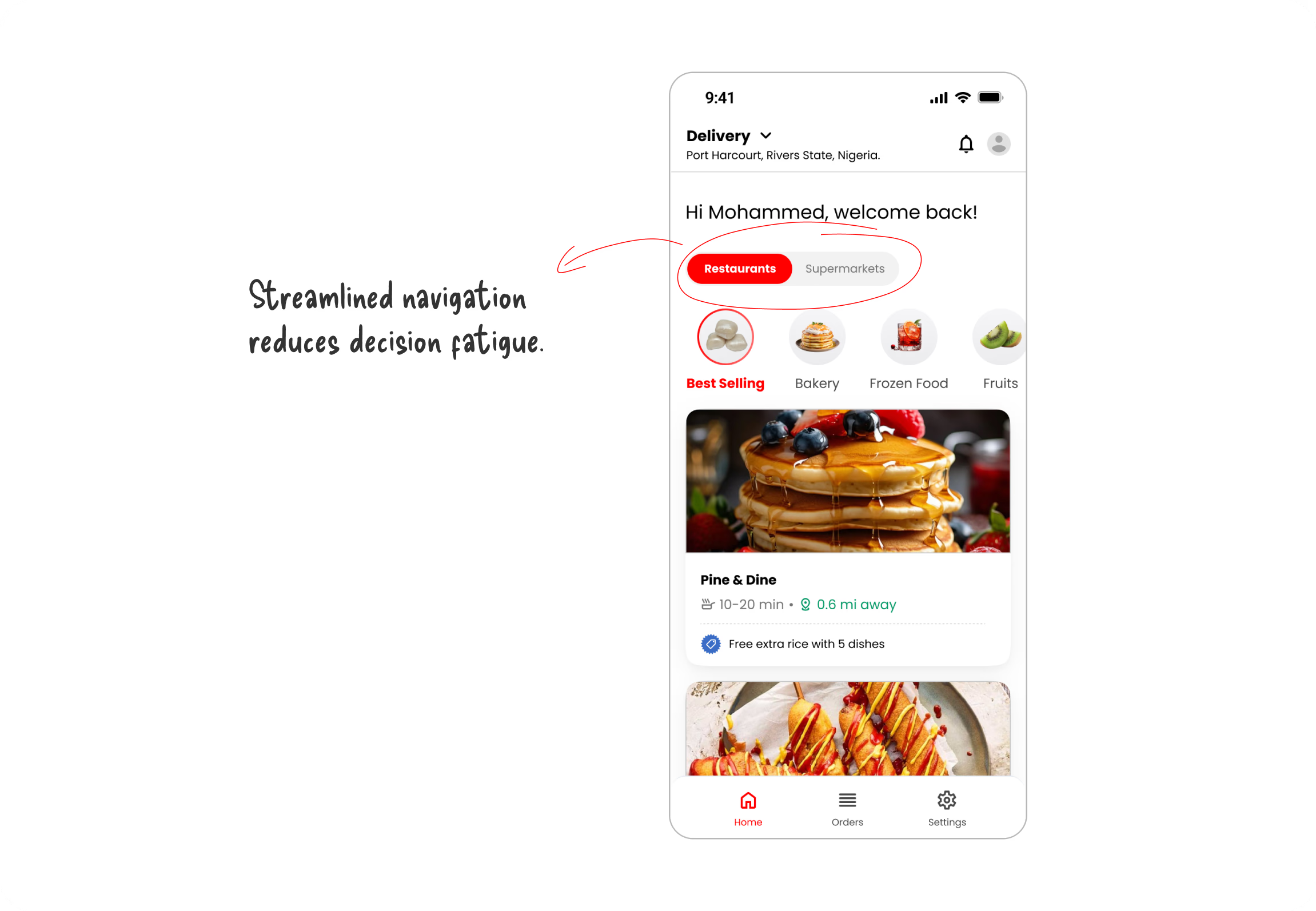
Food decisions are highly visual. Increasing the prominence of food photography allows users to evaluate options faster than relying on text descriptions alone. Categories also reduce the effort required to browse large restaurant collections.
Product Details
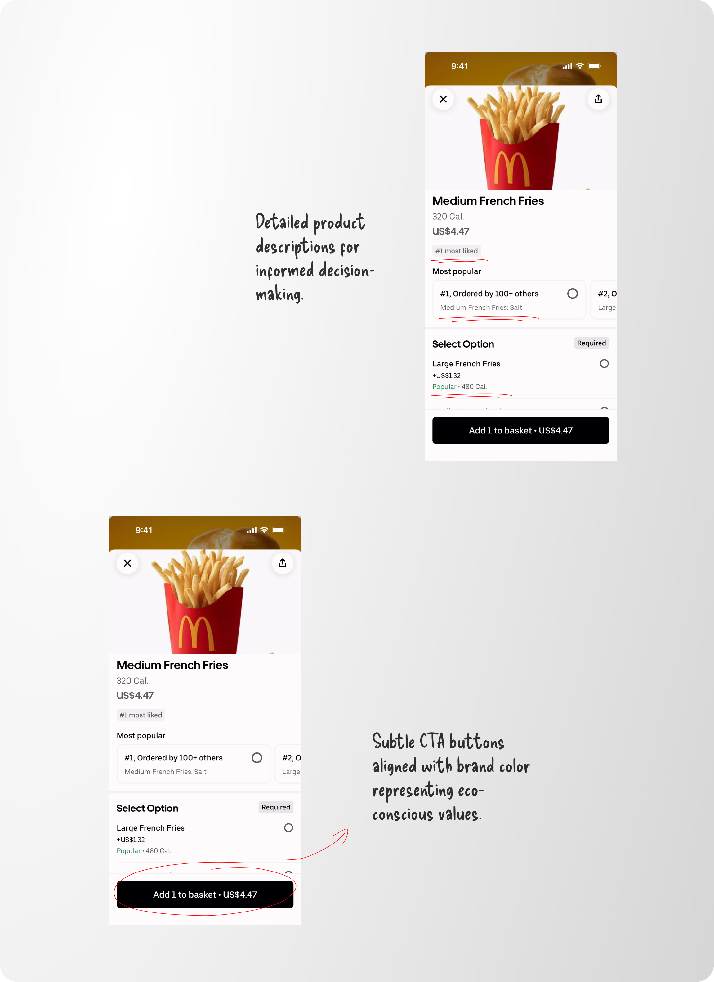
Ordering food involves several decisions. Instead of navigating users through multiple pages, product customization happens within a single focused experience.
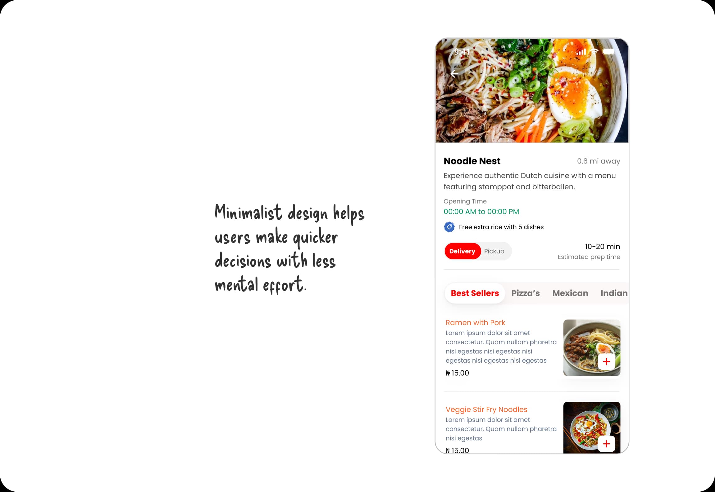
Popular options were surfaced directly within the customization flow to reduce decision fatigue. Rather than asking users to compare every variation equally, recommended choices help accelerate checkout.
Streamlining Checkout
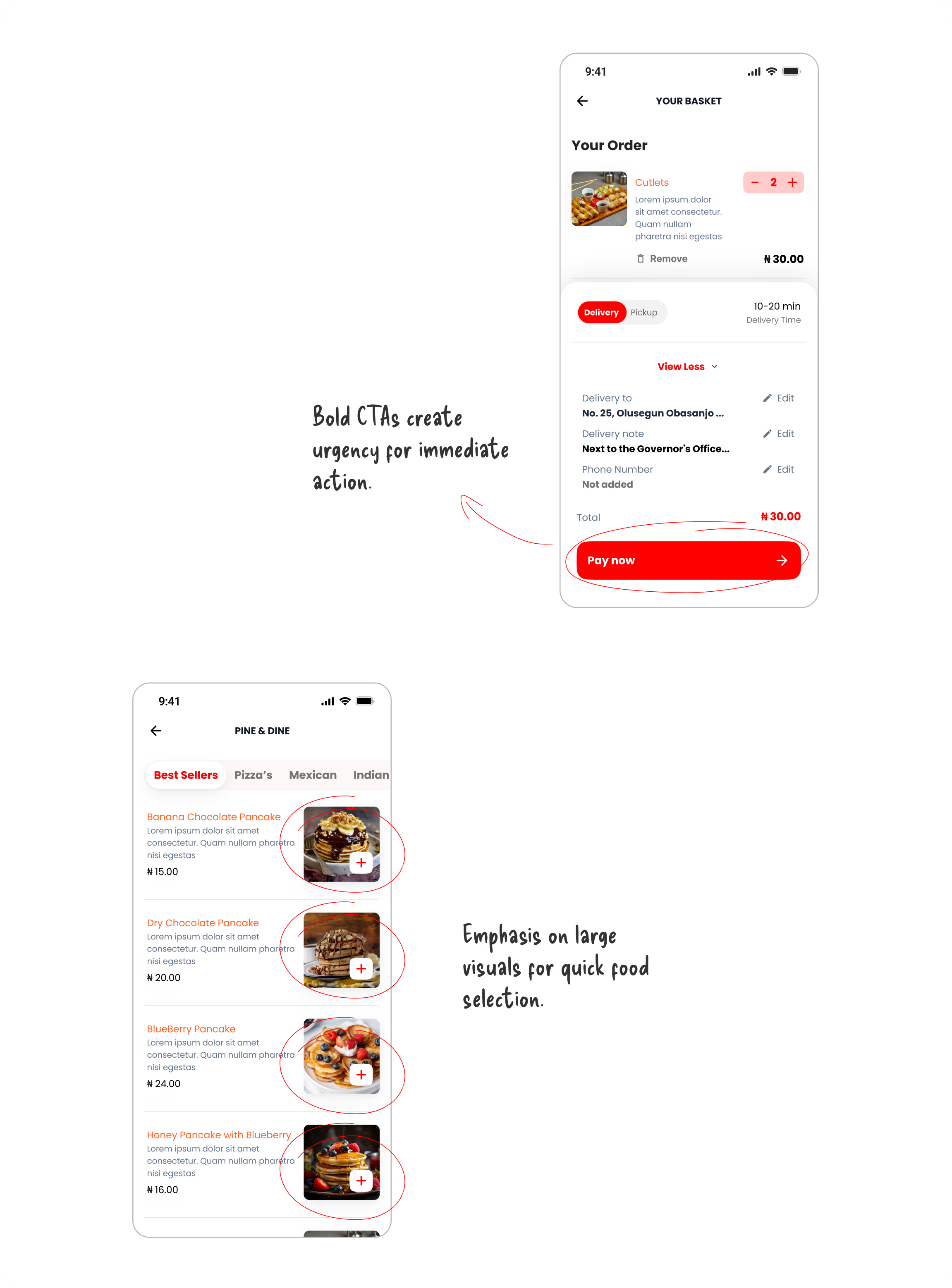
Checkout is often where users abandon purchases. The experience was intentionally simplified by keeping every important action within one screen.
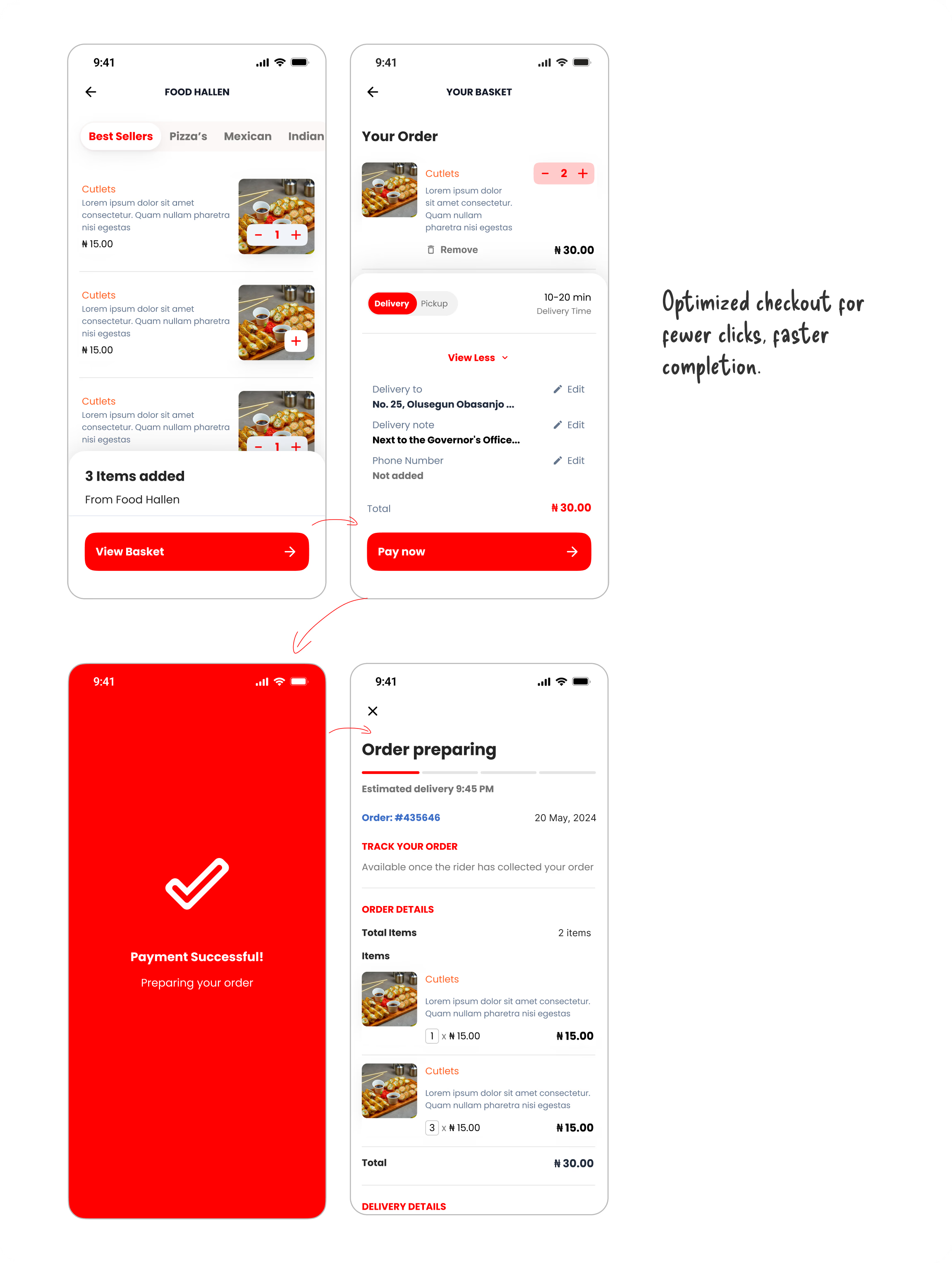
The primary action remains visually dominant throughout the experience, ensuring users always know the next step. Supporting actions remain accessible without competing for attention.
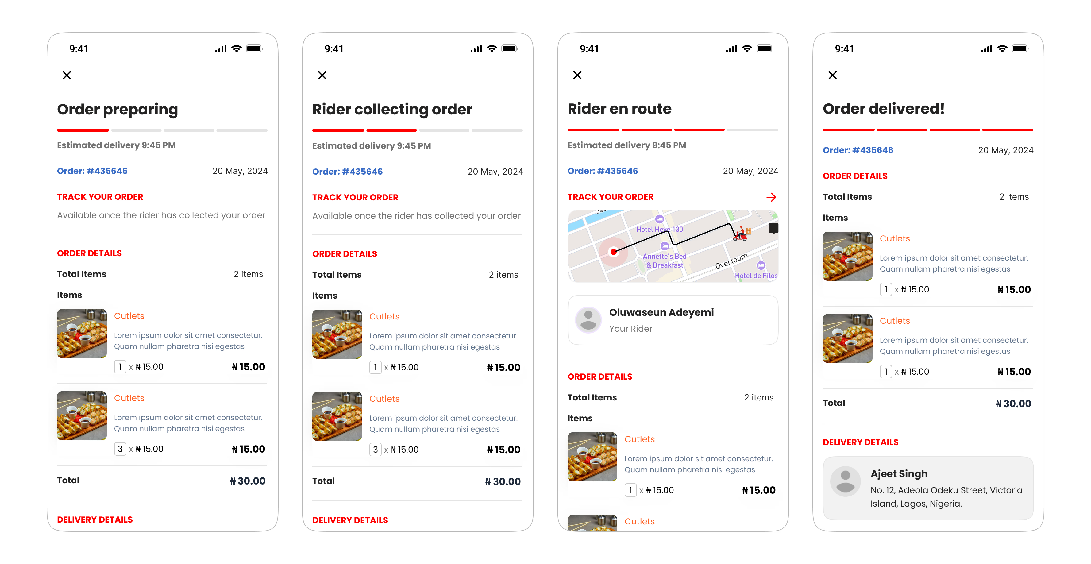
Building Confidence After Payment
Ordering doesn't end after payment. In many cases, anxiety actually increases once money has been spent.
To address this, the order tracking experience communicates progress through clearly defined stages.
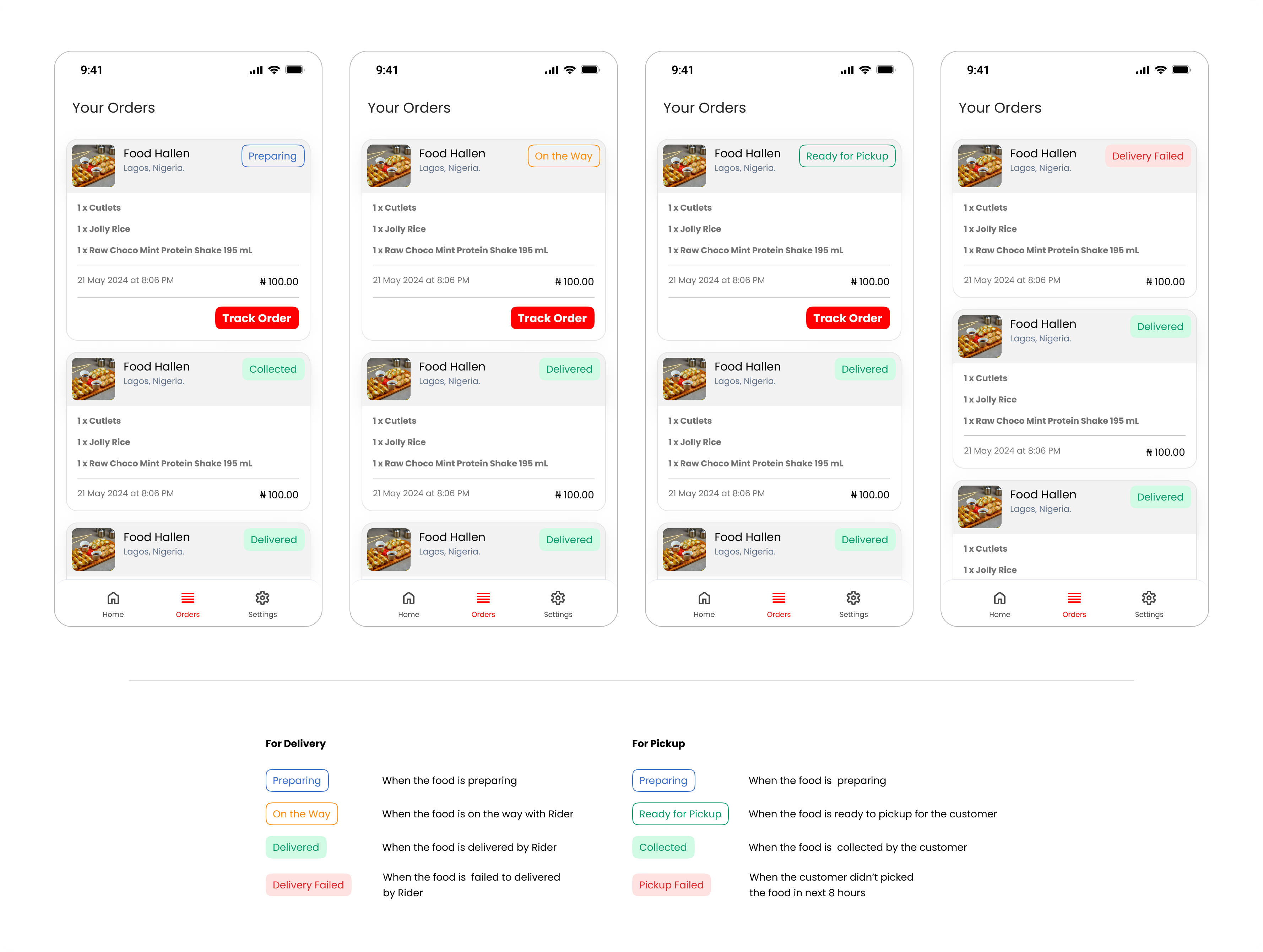
Designing Edge Cases
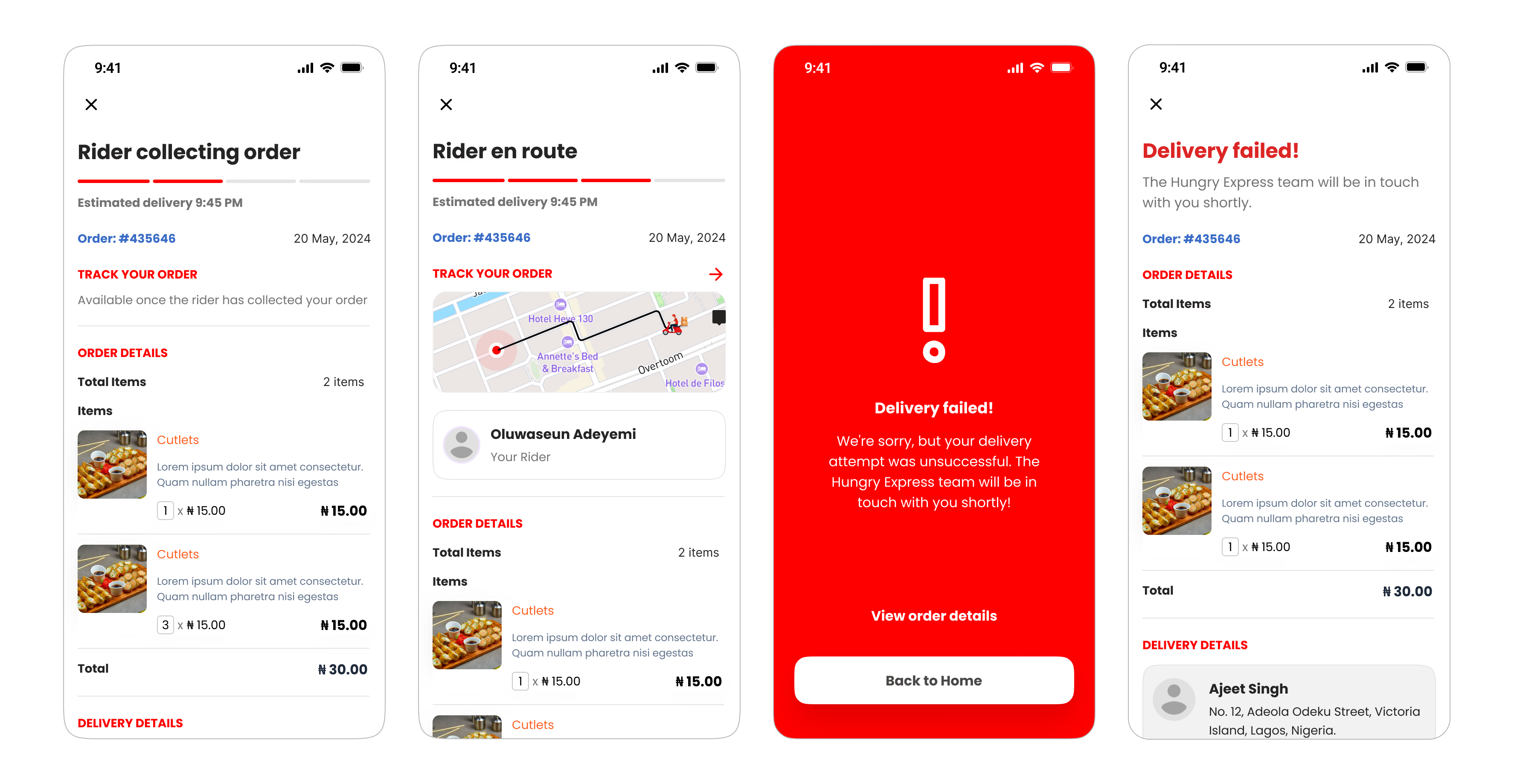
Real-world delivery doesn't always go as planned. Instead of designing only successful journeys, the experience also supports delivery failures.
Users receive clear updates explaining what happened while providing obvious next steps. This prevents uncertainty during unexpected situations.
Delivery & Pickup
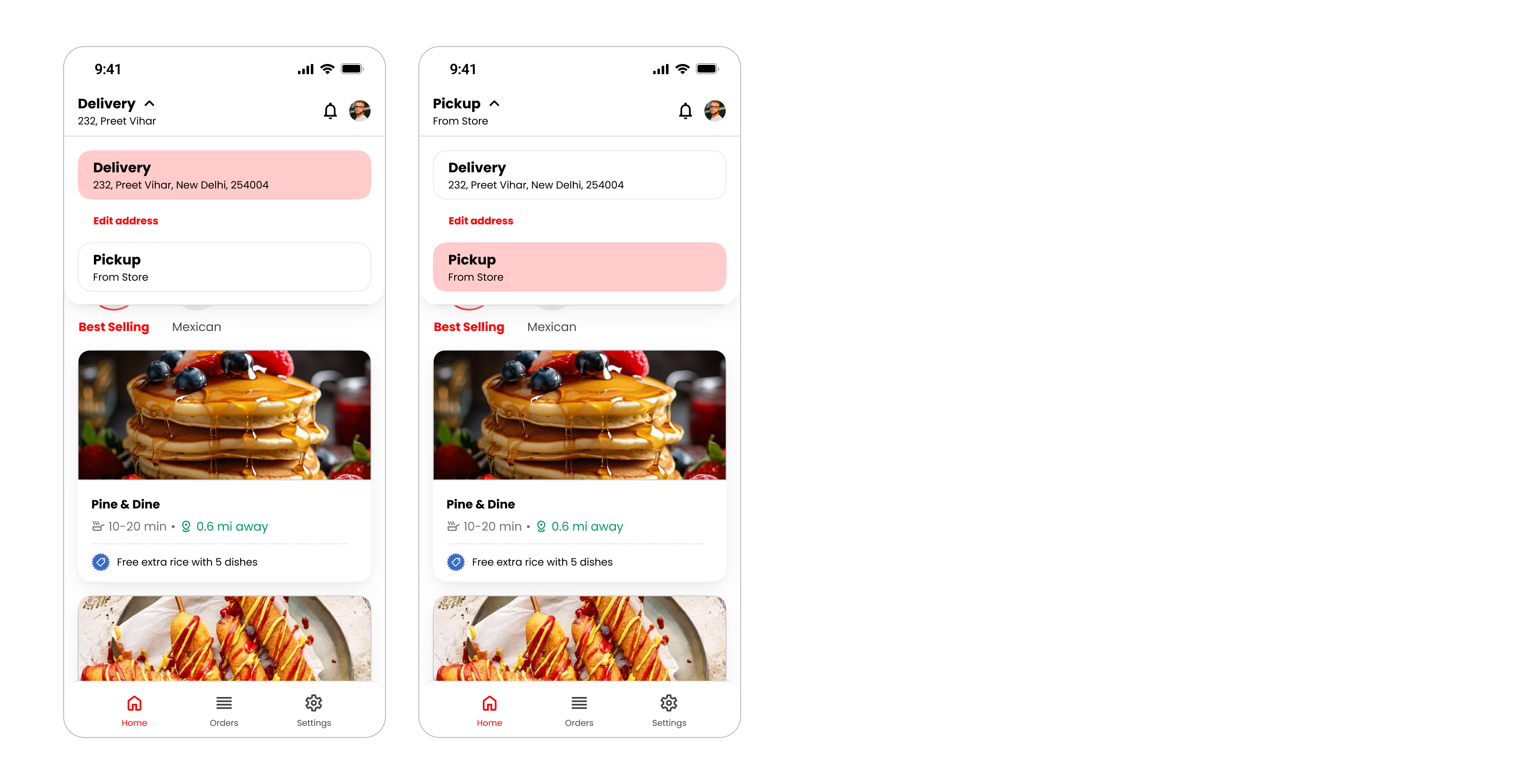
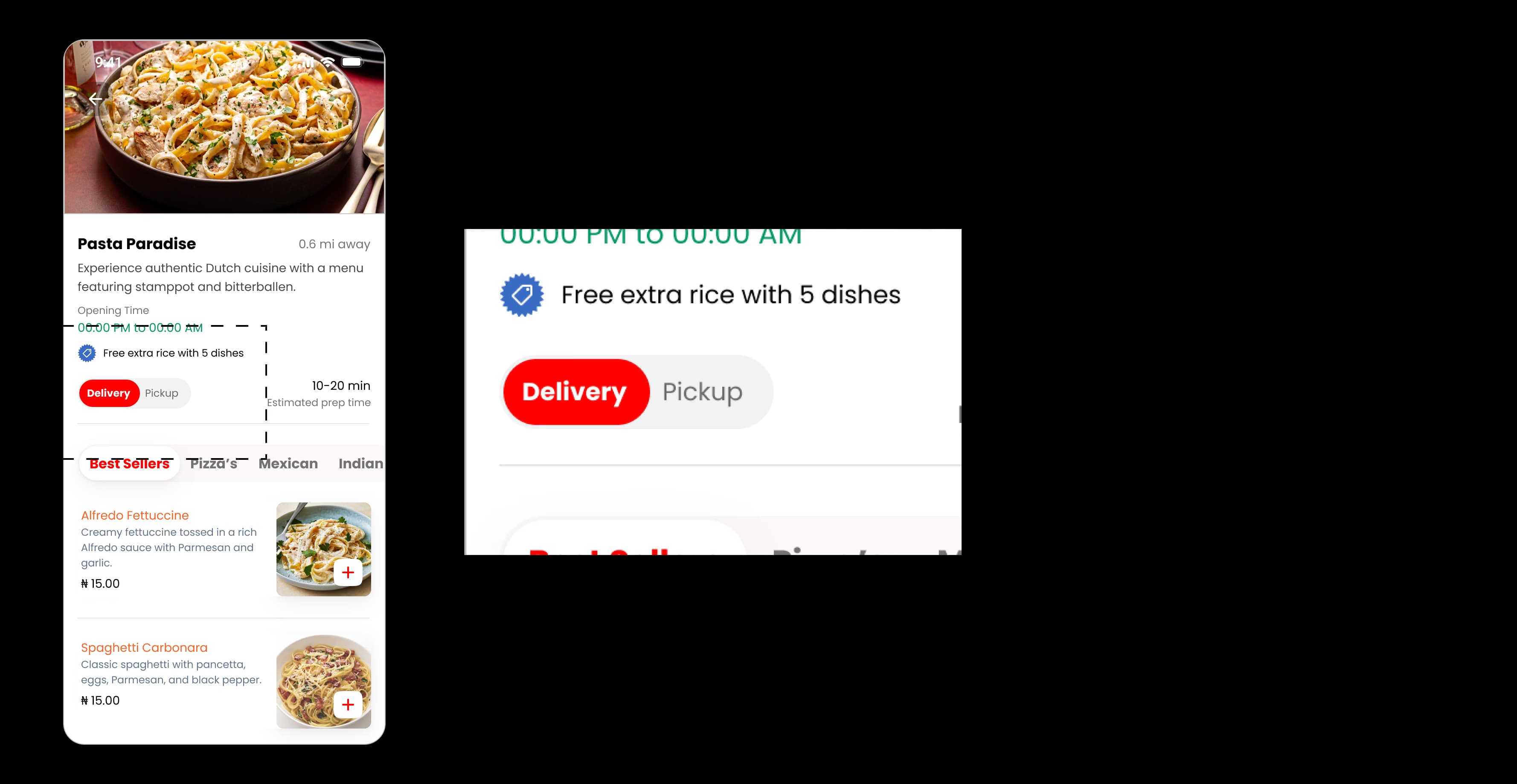
Not every customer wants delivery. Switching between delivery and pickup was designed as a lightweight interaction that preserves the user's browsing context.
This allows users to change fulfilment methods without restarting their journey.
Order History
Past orders become valuable references. Rather than displaying identical cards, order status is communicated using clear visual indicators that make scanning easier.
Whether an order is preparing, completed, cancelled, or failed, users can understand its current state immediately.
Delivery Partner Experience
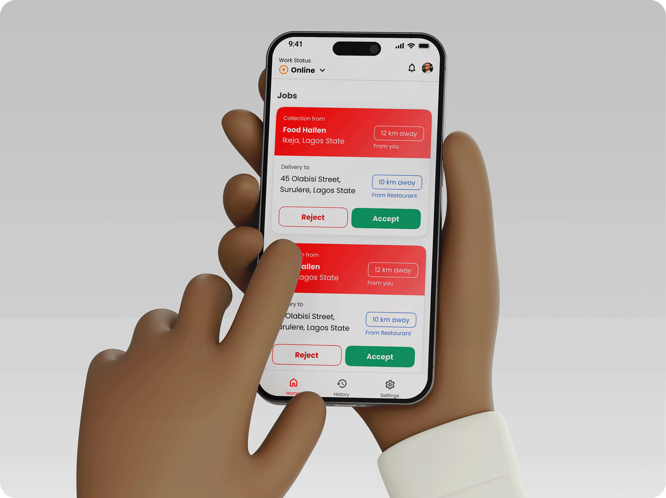
The delivery partner application focused on helping riders complete deliveries with minimal distraction.
Unlike customers, riders interact with the product while moving. Every screen therefore prioritizes speed, clarity, and large touch targets.
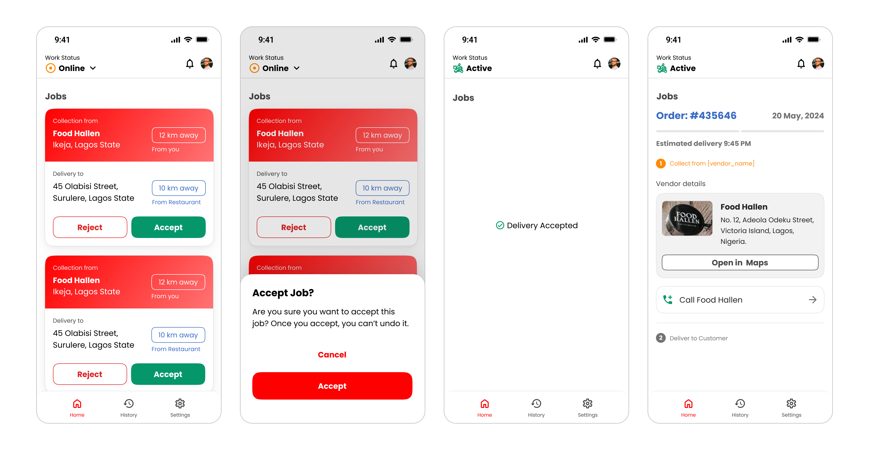
Core Goals — The rider application enables delivery partners to:
Only one delivery remains active at a time. Reducing simultaneous tasks helps riders focus on completing deliveries safely rather than managing multiple competing requests.
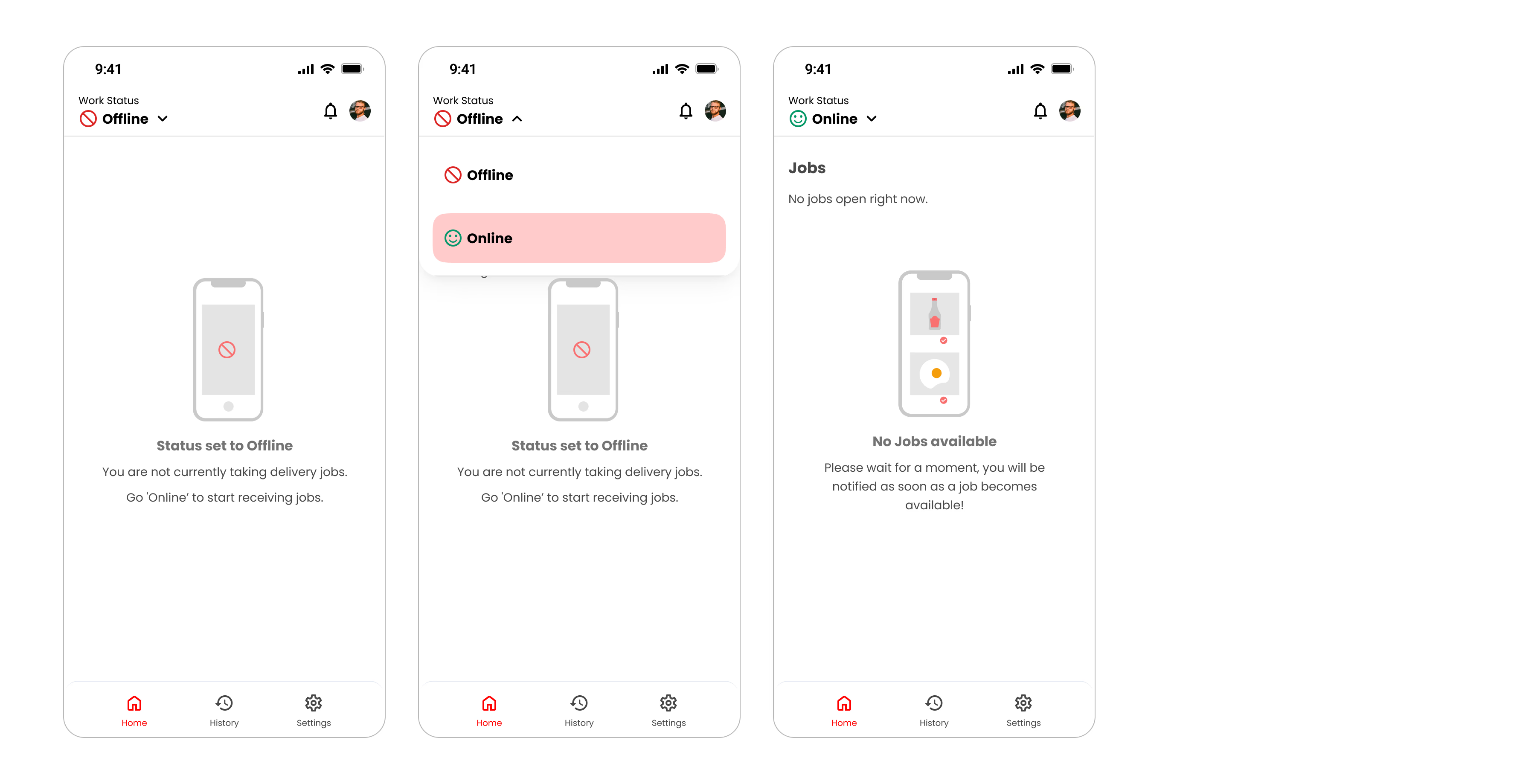
Availability Controls
Drivers should always control when they receive work. The online/offline status allows partners to manage availability while preventing unwanted interruptions.
Vendor Experience
Restaurant owners require a very different workflow.
Instead of browsing content, their primary objective is operational efficiency.
The interface therefore prioritizes incoming orders and preparation status above everything else.
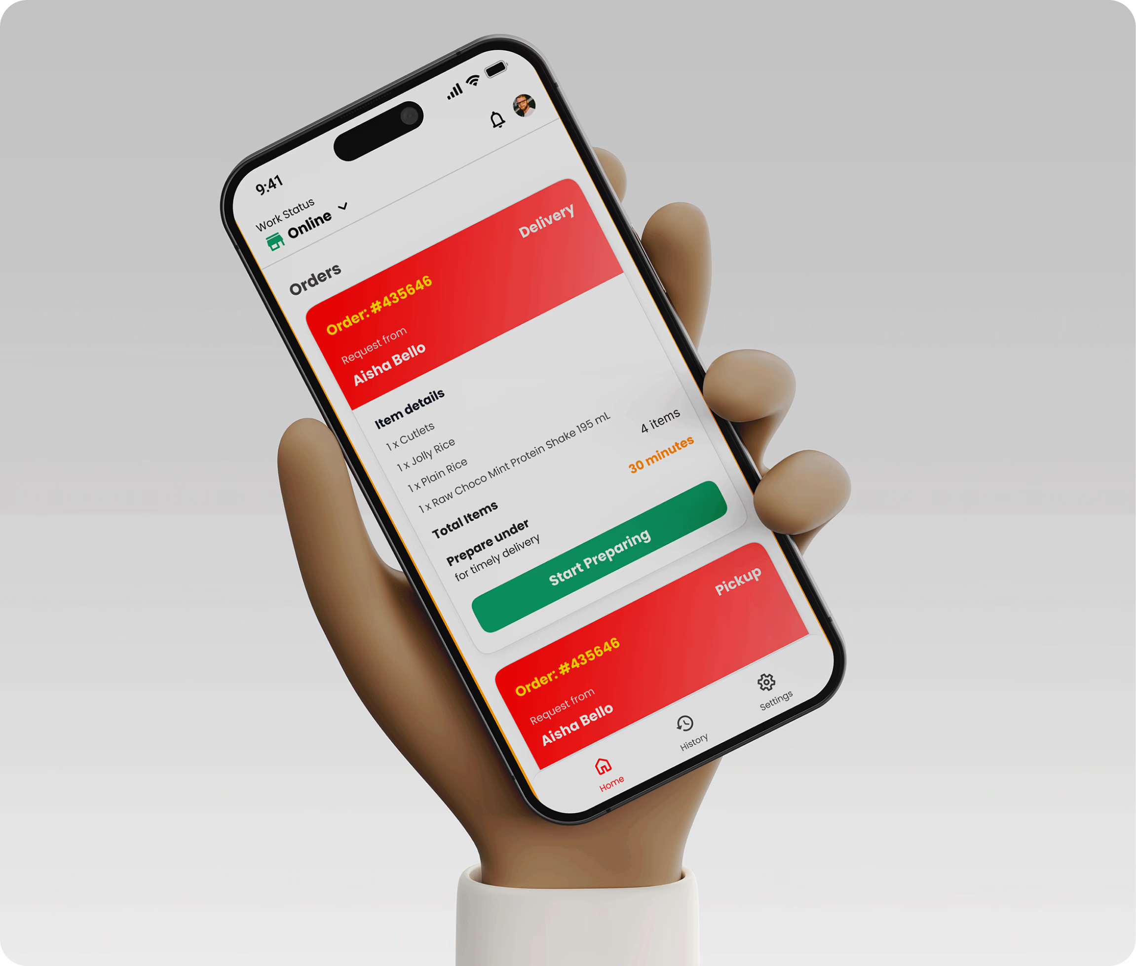
Core Goals — Restaurant owners can:
Incoming orders receive maximum visual priority. Time-sensitive actions remain immediately accessible, allowing restaurants to respond quickly during busy hours.
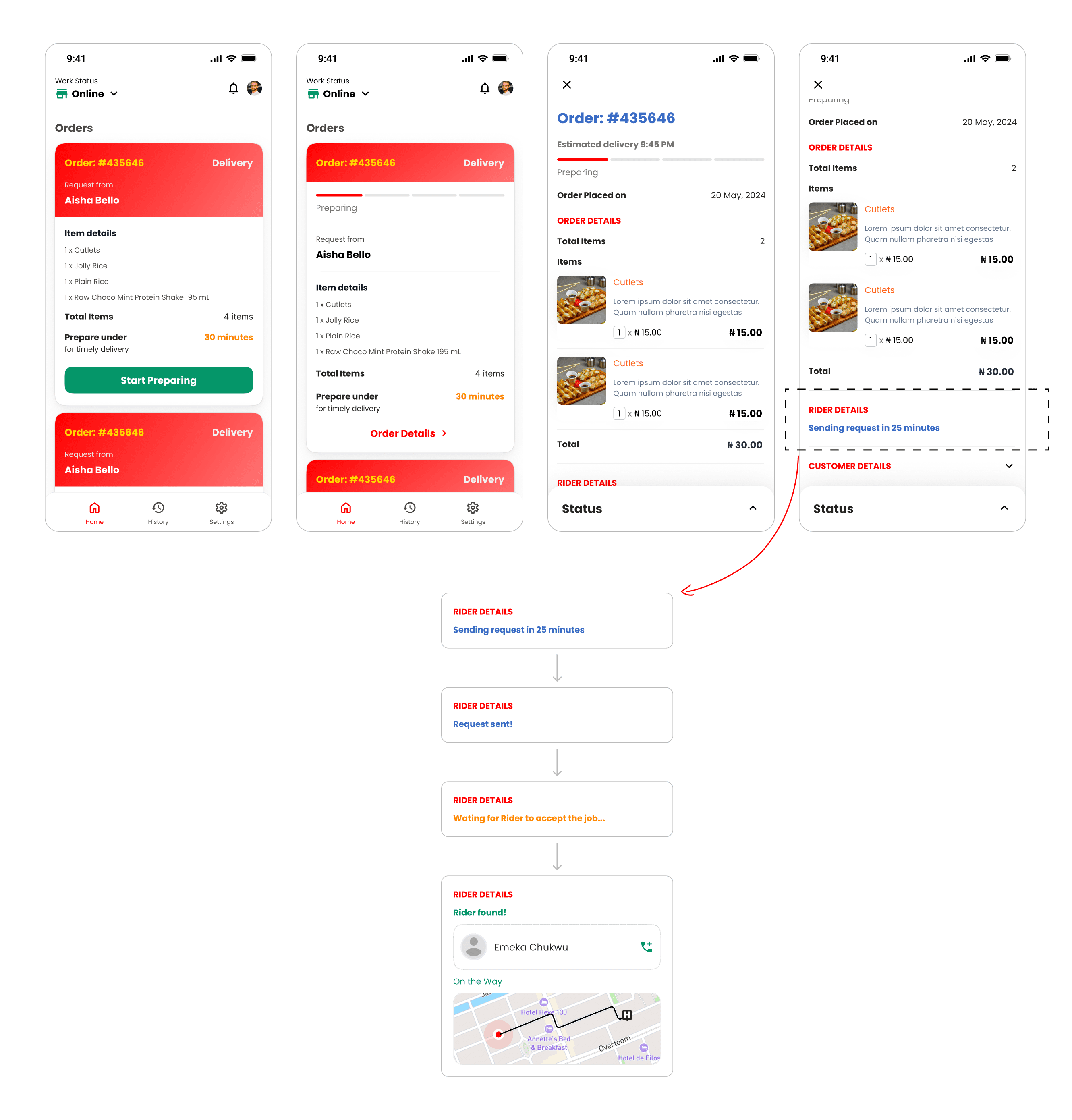
Iteration
Although the project timeline was short, every review improved the product.
Throughout development, designs evolved based on stakeholder feedback and implementation discussions.
Several refinements included:
Rather than treating the first design as final, continuous iteration helped improve usability without extending project timelines.
Key Takeaways
This project reinforced several important lessons.
UX under tight deadlines
Working within tight deadlines doesn't eliminate UX thinking. Instead, it changes where design effort should be invested. Leveraging familiar interaction patterns accelerated decision-making while allowing more time to refine details that directly affected usability.
Interconnected Ecosystems
Designing three interconnected applications highlighted the importance of thinking beyond individual screens. Every interaction influences another user somewhere else in the ecosystem.
The Ecosystem Lifecycle
A successful experience depends on all three products working together.
Reflection
Hunger Express taught me that good product design isn't always about creating entirely new interaction patterns.
Sometimes the best design decision is recognizing when users already understand an experience and building upon that familiarity.
Rather than reinventing food delivery, I focused on reducing friction, improving clarity, and designing a system that supports every participant in the ordering journey.
Looking back, I'd further strengthen the product by validating assumptions through usability testing, analyzing behavioral metrics after launch, and exploring personalization opportunities for restaurant discovery.