Genesis AI
Role:
Sr. Product Designer
Duration:
9 Months
Team Size:
2
Platform:
Desktop

Project Overview
Genesis AI is a core internal B2B CPQ (Configure, Price, Quote) platform designed to help sales and operations teams efficiently create, manage, and present product configurations for enterprise clients.
The system operates through two primary roles:
1. Admin (Configuration Setup)
Admins define the foundation of the system for their sales team by:
Creating and managing product catalogs (eCatalog)
Structuring products into categories, item types, and options
Defining pricing logic, including formulas, discounts, and dependencies
Setting configuration rules (e.g., inclusion/exclusion of products based on selections)
Managing cross-sell and recommendation logic
This layer ensures that all configurations follow business rules and remain scalable across industries.
2. End User (Sales Representatives)
Sales teams use the platform to:
Configure products based on customer requirements
Add or remove options dynamically
Validate configurations in real time
Generate accurate quotes
Share finalized quotes with customers
The goal is to enable faster, more accurate, and more confident selling experiences.
The Challenge
The legacy CPQ was outdated, slow, and not aligned with the industry shift toward AI-assisted configuration. Users struggled with hidden complexity, disconnected admin logic, and workflows that demanded far more effort than necessary.
My Approach
I redesigned the whole system by reimagining the system from the ground up — auditing every legacy flow, co-creating with stakeholders, and designing a modern, AI-assisted experience that balances automation with human control.
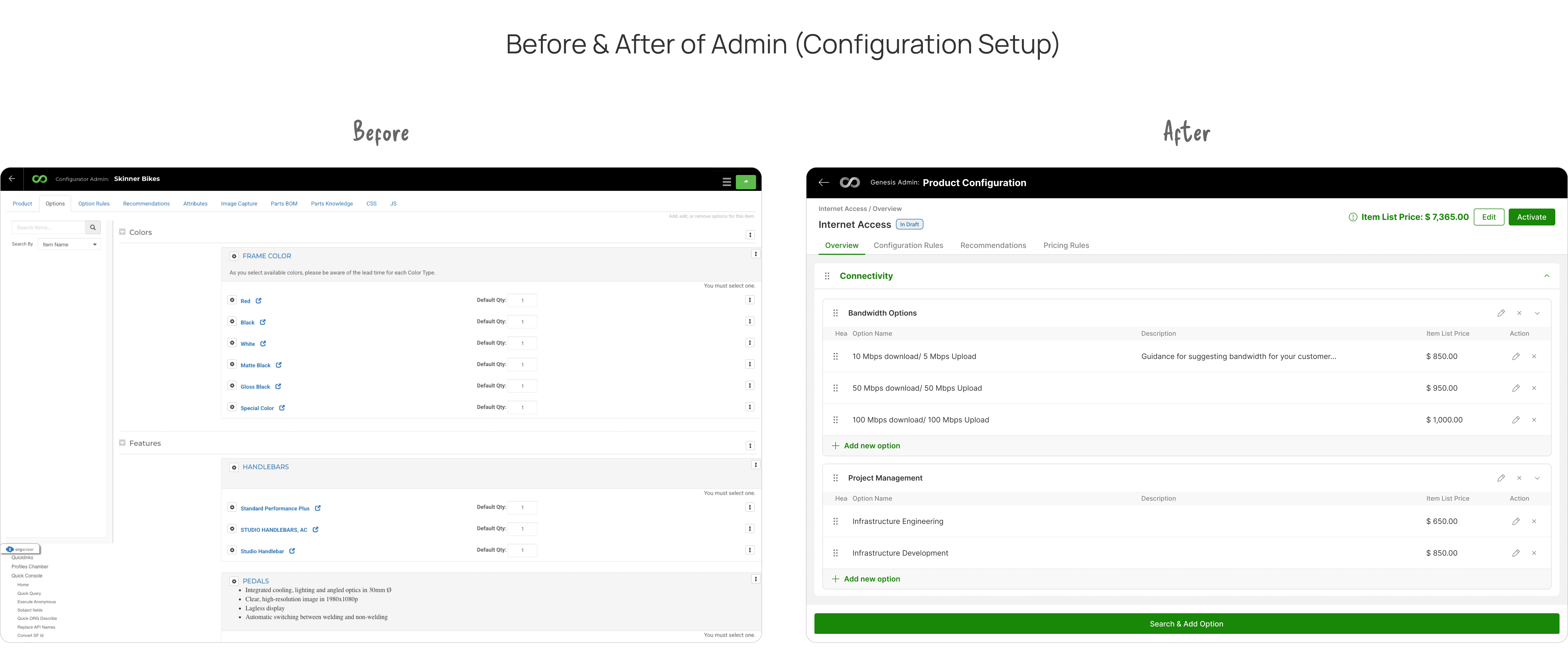
What broke — and why we had to rethink the configurator?
🔷 1. User Pain Points
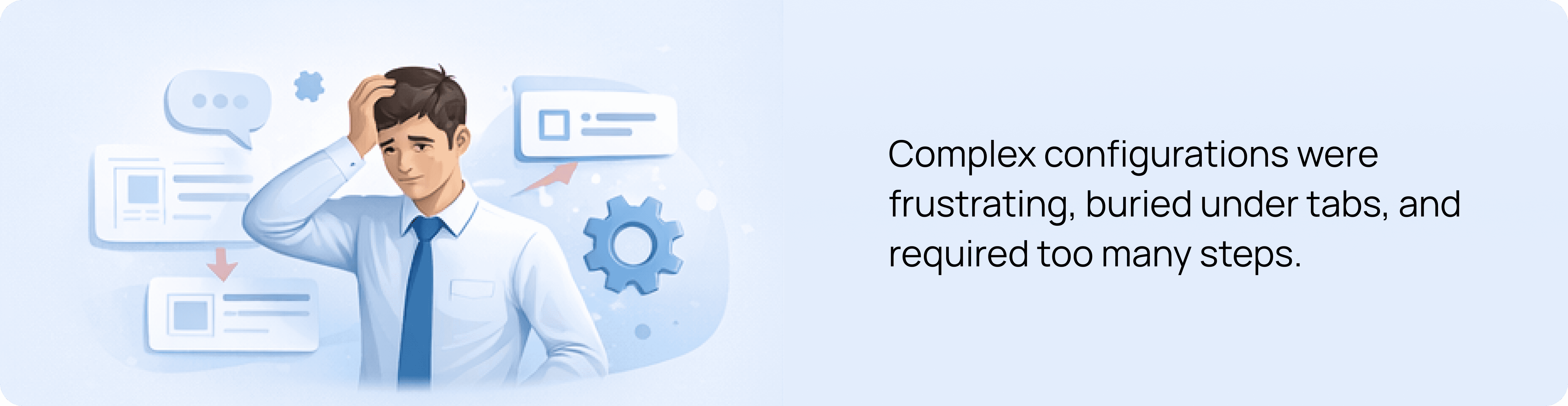
Too many clicks to configure even simple products
Attributes were hidden in separate tabs, breaking user flow
No clear distinction between product-level and option-level changes
Users lost context while scrolling through long option lists
Frequent back-and-forth just to validate pricing or configurations
👉 Impact: Slower workflows, frustration, and lack of confidence during sales calls
🔷 2. Business Challenges

Sales teams struggled to create quotes quickly during live demos
Heavy dependency on designers or pre-made decks for presentations
Inconsistent configurations across teams led to errors
Increasing need for AI-assisted workflows to stay competitive
Product wasn’t scalable across industries (Manufacturing, SaaS, IoT, XaaS)
👉 Impact: Lost efficiency, reduced conversion speed, and poor demo experience
🔷 3. Technical Limitations
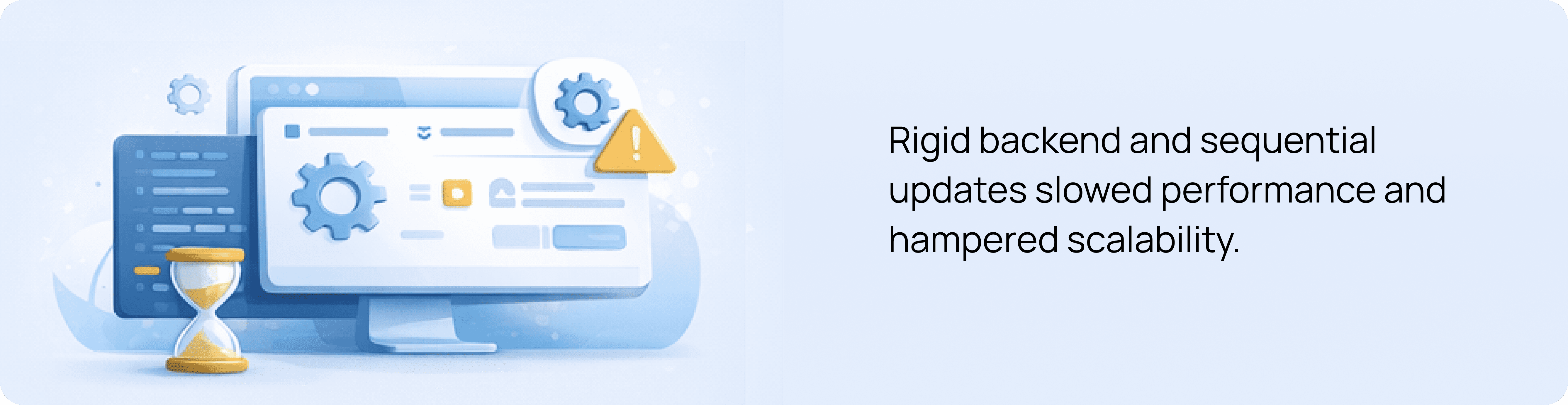
Legacy tab-based architecture restricted flow redesign
Rules engine processed configurations sequentially → delays in feedback
Backend attribute structure limited dynamic UI rendering
UI components weren’t built for flexible admin configurations
No optimized data structure to support AI-driven suggestions
👉 Impact: Slower system response, rigid UI, and limited innovation capability
🔷 4. Experience Gaps (AI + UX Opportunity)
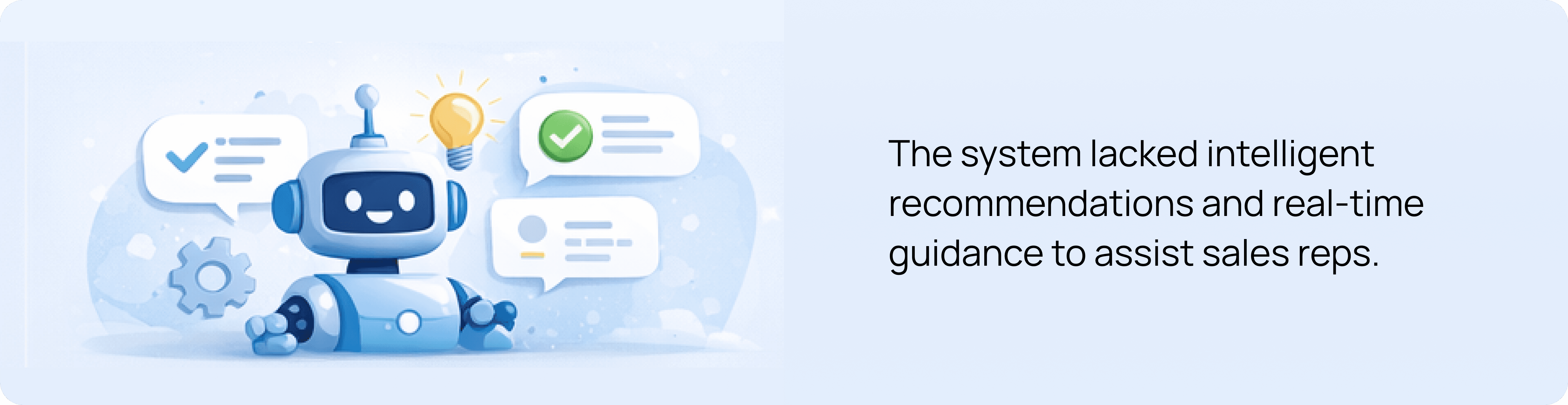
No intelligent guidance for configuration decisions
Users relied on manual validation instead of system assistance
No visibility into why conflicts occurred
Lack of real-time feedback while configuring
No assistive layer to reduce cognitive load
👉 Opportunity: Introduce AI as a co-pilot to guide, validate, and accelerate decisions
My role
My responsibilities spanned the entire lifecycle:
Product discovery with CEO & stakeholders
Creating clarity out of chaos (auditing legacy flows)
Designing a scalable system across End-User & Admin panels
Facilitating cross-functional workshops
Collaborating deeply with PM & VP of Design
Establishing feasibility with dev architects
Final handoff and implementation QA

*A snapshot of me working on this project during a workation in Kochi, Kerala.
Our very first call was with the CEO.
Not for approvals — but for alignment.
He described his vision:
“Our Customer's sales cycle needs to shrink — reps should be able to configure and quote in minutes, not hours.”
“Right now, we lose time because reps manually adjust configurations. I want AI to eliminate 70–80% of that effort.”
“The AI should be smart enough to suggest the right bundles and warn users before they break a rule.”
“I want a UI we’re proud to demo to an enterprise customer without preparation. That’s the bar.”
I approached this call like a strategist.
Understanding the "why" up front helped define the guardrails for every future decision.
Why are sales reps spending more time configuring than selling?
Why do we believe AI is the right accelerator for this workflow now?
Why do configurations vary so much between different teams or regions?
Why do live demos require separate decks instead of using the product directly?
Why do admins rely on spreadsheets or external documents to manage rules?
Why are conflict messages unclear or easily missed by users?
Why do complex products still require manual review despite having rules?
Why is critical information hidden below the fold in the current UI?
Why do customers often need follow-up clarifications during configuration calls?
Why is the current configurator unable to scale to new industries or pricing models?
Auditing the Legacy System (Becoming a Detective 🕵️)
So, I pulled every legacy screen into Miro — hundreds of flows.
I treated this audit like forensic analysis.
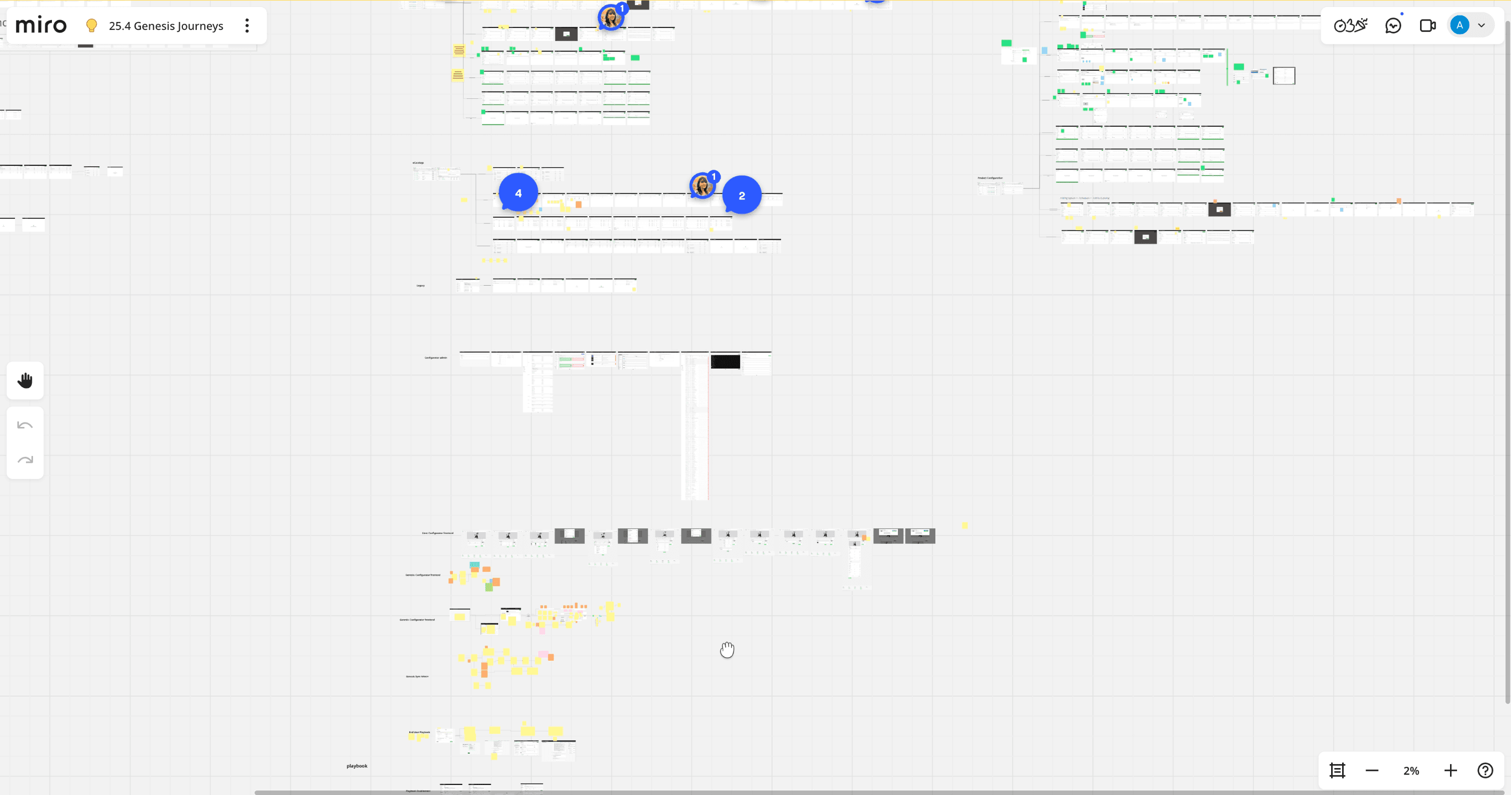
*A snapshot of miro board while auditing legacy configurator designs.
Before proposing improvement, I needed to understand:
What breaks?
What slows users down?
Where does cognitive overload occur?
Which patterns contradict expectations?
We invited stakeholders from sales, ops, and admin into Miro workshops.
We circled:
Must-keep features
Pain points
Missing use-cases
Opportunities for AI assistance
Stakeholders usually describe symptoms. My job was to uncover the root causes behind them.
So I kept asking:
“What’s happening here?”
“What are you trying to achieve in this moment?”
“What slows you down?”
Those conversations shaped the foundation of our new system.
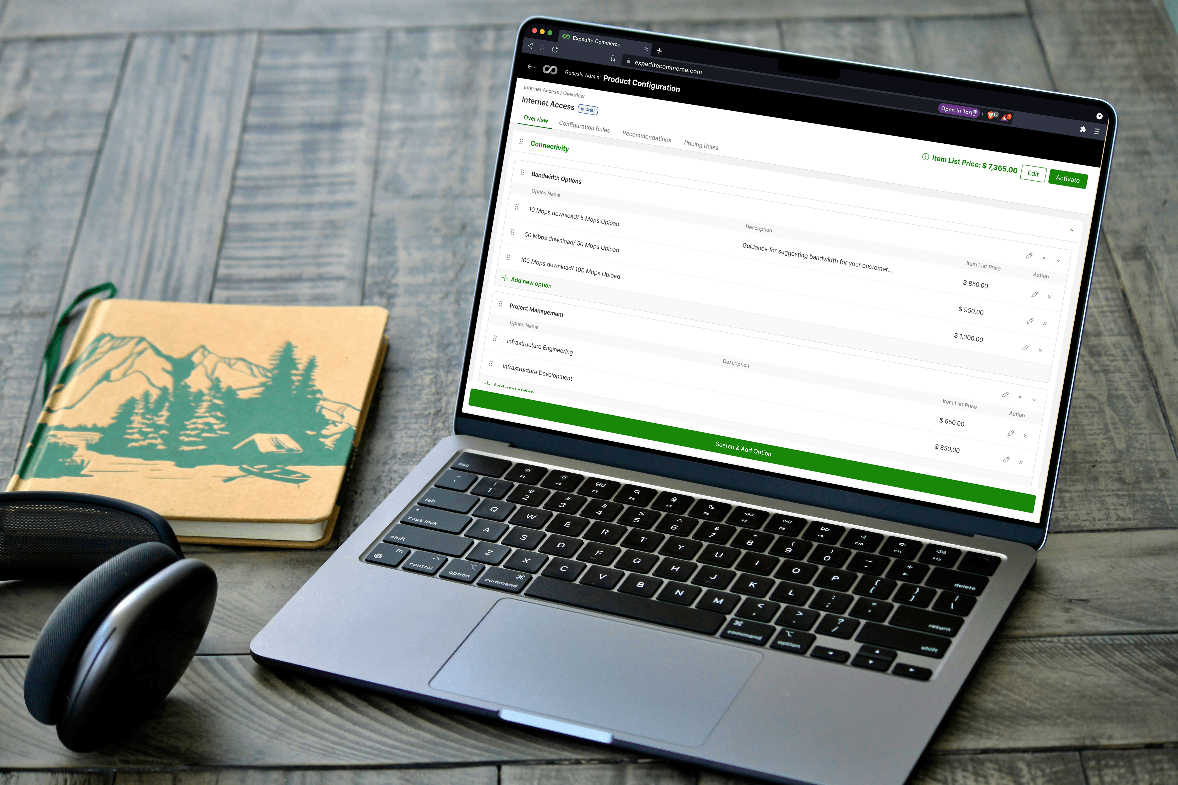
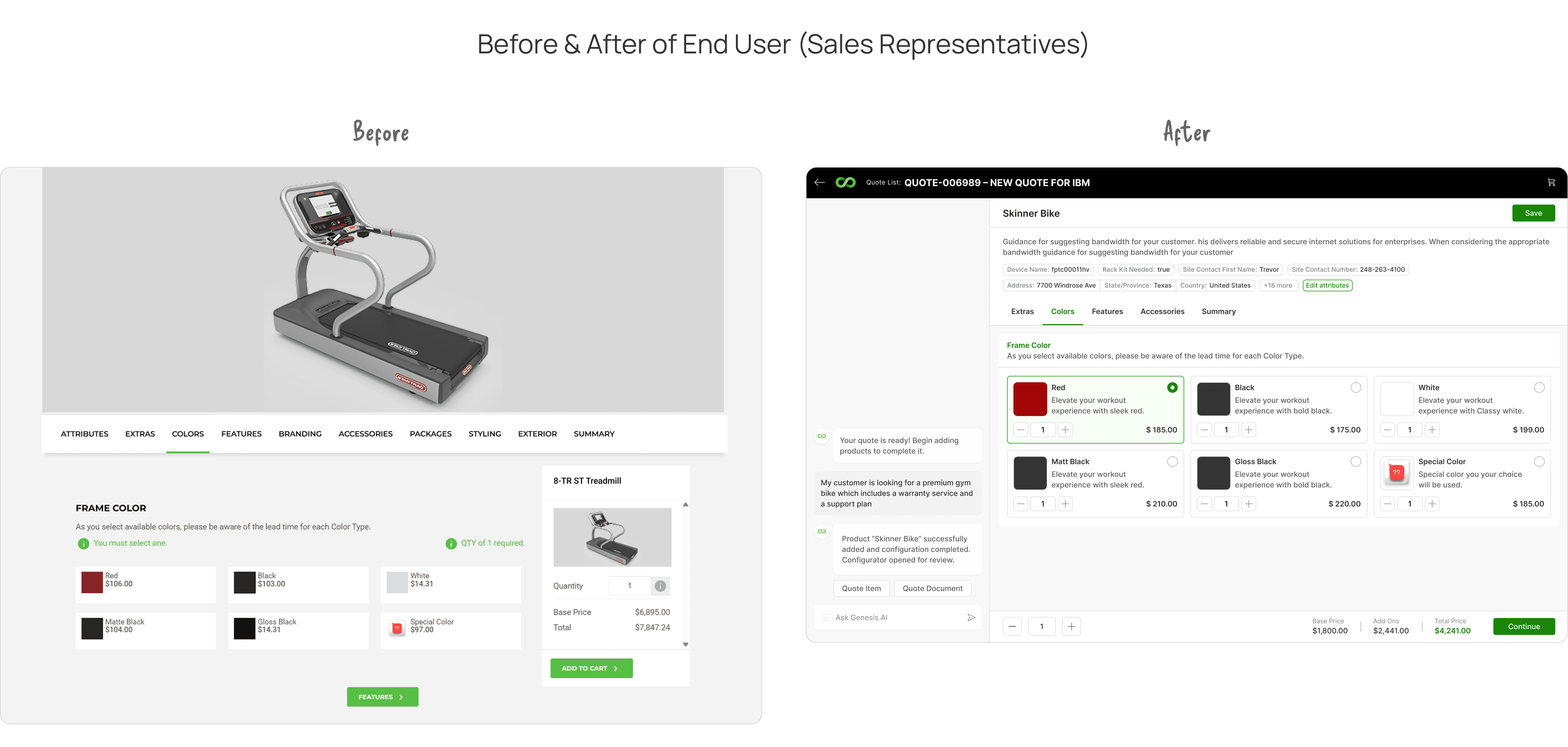
Shaping the Final Experience👨🏻💻
Using our design system, Me and my colleague built the first full iteration.
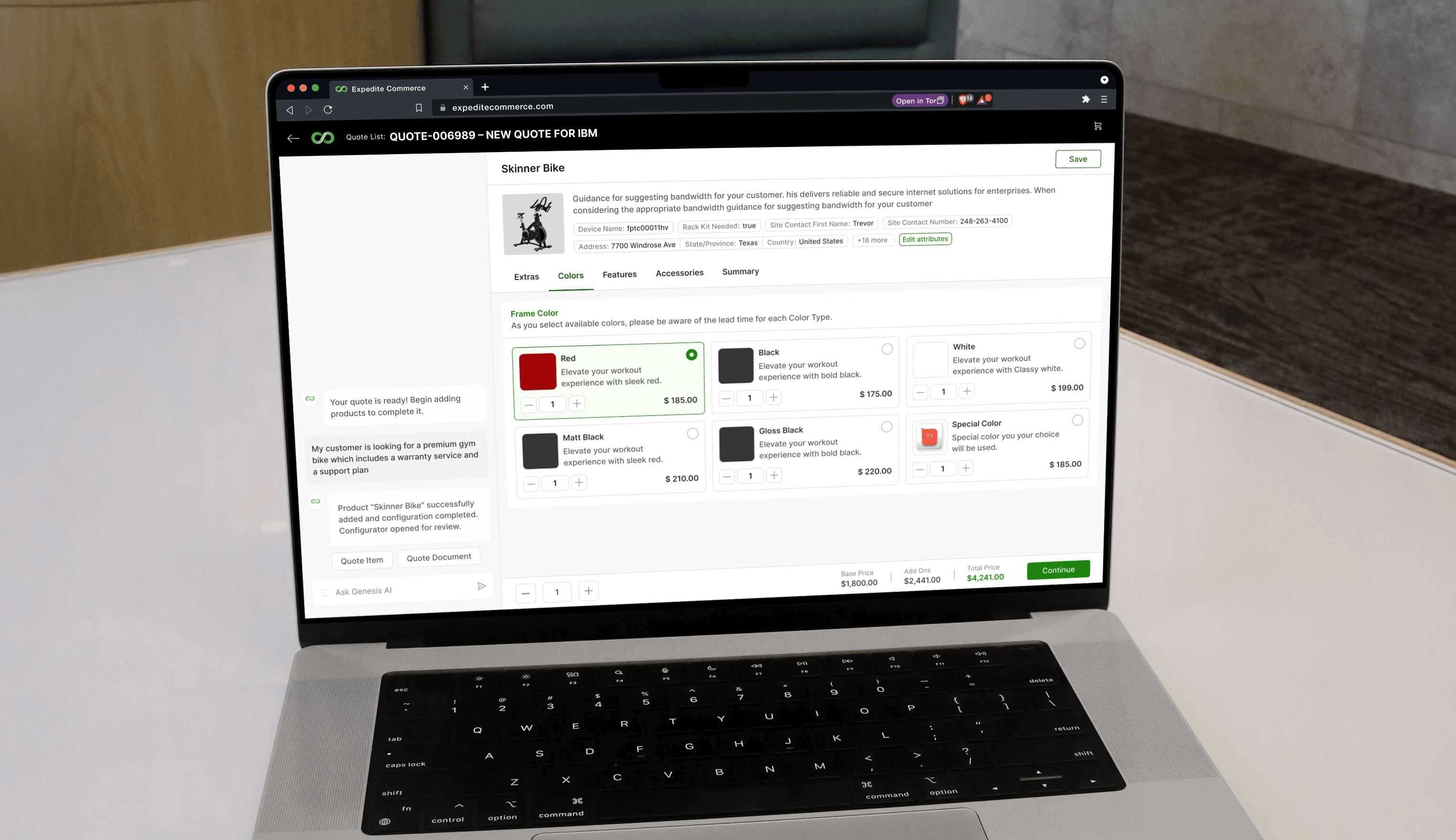
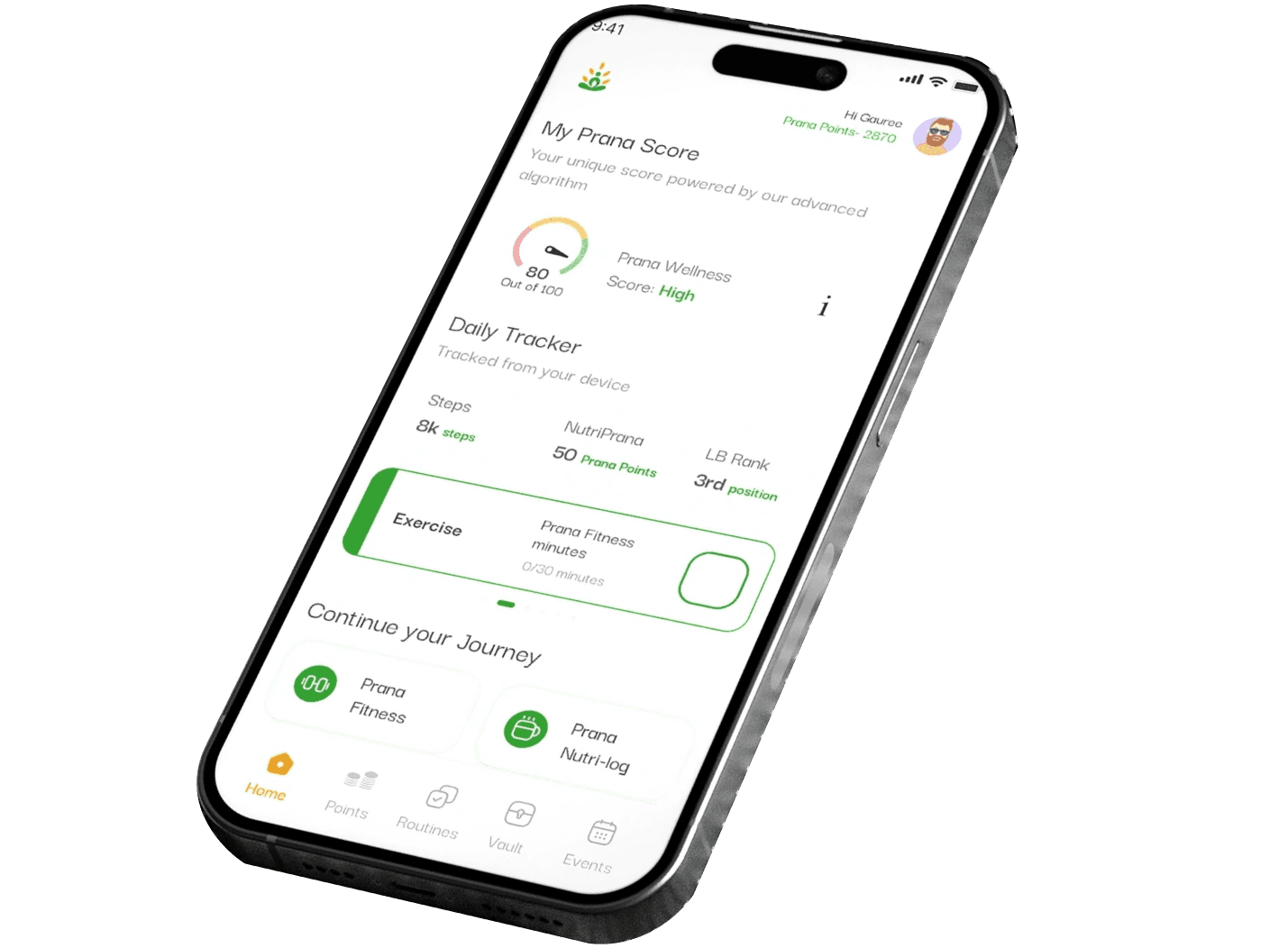
*A Mockup of one of the screen from End User newly designed configurator.
Key Design Decisions (End User Configurator) —
1. The AI Panel
The AI panel was the core part of the redesign — not as a flashy addition, but as a response to the industry shift toward AI-assisted guided configuration.
Why the Left Side?
We followed a powerful UX law:
👉 Jackobs Law: Users expect consistent behavior across tools they already use.
Most modern platforms — ChatGPT, GitHub Copilot, configuration assistants — place intelligence on the left side and the workspace on the right.
This mental model helped users immediately understand where to talk to AI and where work happens.
Why not the right?
We explored placing AI on the right, but it made the assistant feel secondary.
Our vision was the opposite:
Write to AI → AI configures the product → Manual adjustments come last.
What is the AI Panel’s job?
The AI panel acts as a playbook for reps, enabling them to:
configure products without touching the manual UI
resolve conflicts automatically or through micro-prompts
generate configurations faster
focus on conversations, not controls
PROTOTYPE- AI MOVING FROM FULL SCREEN TO HALF ON LEFT
The Header
The header anchors the entire experience by giving constant visibility into:
Product name
Description
Product image
Key product-level attributes
Critical CTAs
Design Decision: Collapsing Header
As users scroll deep into options, the header collapses into a compact format, showing only the essentials:
Smaller product image
Product name
CTAs
Key attributes
PROTOTYPE-
This solves a recurring usability issue:
👉 Users lost context when attributes and product summary disappeared off-screen.
Collapsing preserved context while freeing space for what mattered most — the options and attributes below.
Hierarchy:
Item Category → Item Type → Item
We retained the legacy mental model because it already matched user expectations, but we simplified and clarified it.
Old Problem:
Categories, types, and items blurred together, leading to confusion.
New Structure:
Item Category → Fixed tabs
Item Type → Sticky headers
Item (Options) → Card-based grid
This created a predictable, stable hierarchy where users always know:
where they are
what group they’re modifying
what options belong to which category
A configurator should feel like a guided flow — not a guessing game.
Sticky Header (For Item Types)
PROTOTYPE-
Earlier, when users scrolled through long lists of options, the category or item type header would disappear — leaving users unsure:
“Which category am I in right now?”
We made the category header sticky
This ensured:
Constant orientation
Clear boundary between types
Faster scanning
Reduced cognitive load
In long configuration flows, this simple fix improved clarity dramatically.
The Option's Cards Redesign
The cards are the heart of the configurator — they’re where users make their actual choices.
But the old cards were one of the biggest pain points in the system.
What was wrong earlier
The old cards suffered from:
Cluttered layouts
No visual hierarchy
Too many inconsistent variants
No scalability as product data grew
Admin-controlled toggles that broke layouts
Admins could choose to show:
image or no image
price or no price
quantity or no quantity
attributes or no attributes
This created dozens of unpredictable combinations, and the UI fell apart in many of them.
Our Design Philosophy
We grounded the redesign on four principles:
1. Flexibility
Cards must adapt to any admin configuration without breaking.
2. Scalability
Cards should work across:
1-Up (full width)
2-Up (two per row)
3-Up (three per row)
3. Clarity
Users should instantly understand:
What the option is
What’s included
What changes when they pick something
4. Information Density (with control)
Show information when needed, hide it when it isn’t.
The Biggest Challenge while designing cards
Because admins can toggle elements freely, the card layout needed to work in every possible variation.
Example:
A card should still look clean if:
there’s no image,
no price,
no attributes, and
only a title is shown.
Or the opposite:
When everything is turned on, the layout must still stay readable and scannable.
Our Solution:
We built a matrix of every possible variant and tested:
with image vs without
price vs no price
long vs short titles
1-Up vs 2-Up vs 3-Up layouts
admin attributes on vs off
This prevented surprises in production.
Final Card Types
One-Up (Full Width)
Two-Up
Three-Up